Identity / Typography / Illustration
Tipsy PeachBoutique.
A boutique identity built from two parts: a drawn peach and a flowing script. Together they make a lockup that works in colour, in black, in white and over photography.
01 / The illustration
A peach with a dress inside it.
The peach sits between the two words and does two jobs: it breaks the script like a letter, and it stands on its own as an emblem. Its cut face holds the silhouette of a dress on a hanger, with a small spark of light above.

02 / Typography
A script and a whisper of capitals.
Tipsy Peach is set in a looping script with long, generous swashes. BOUTIQUE sits beneath it in small, widely spaced capitals, a quiet line that steadies the script and keeps the name readable at small sizes.
03 / Colour versions
Peach, black and white.
The illustration keeps its colour in every version; only the type changes. Peach type for the primary mark, white on dark grounds, black for one-colour print.
- Peach#F5824C
- Leaf#628414
- Black#000000
- White#FFFFFF
04 / On photography
Over the real thing.
The white version over a photograph of ripe peaches: the script stays light, and the drawn peach holds its own against the real fruit.
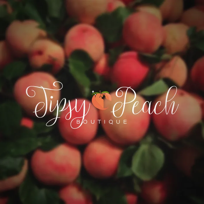
Prior independent work by ForwardMade's founder, shown as part of this portfolio. It was not commissioned through ForwardMade. The Tipsy Peach Boutique name and mark belong to their owner.
Next project / 04Automotive